


Responsive design & mobile-first websites
Responsive design & mobile-first websites
In today’s digital-first world, the majority of users browse websites on their mobile devices. As of 2025, over 70% of global web traffic comes from smartphones and tablets. That’s why responsive design and mobile-first websites are no longer optional—they’re essential for businesses that want to succeed online.
In this blog, we’ll explore the importance of responsive design, the benefits of a mobile-first approach, and the best practices to ensure your website is optimized for every device.
What is Responsive Design?
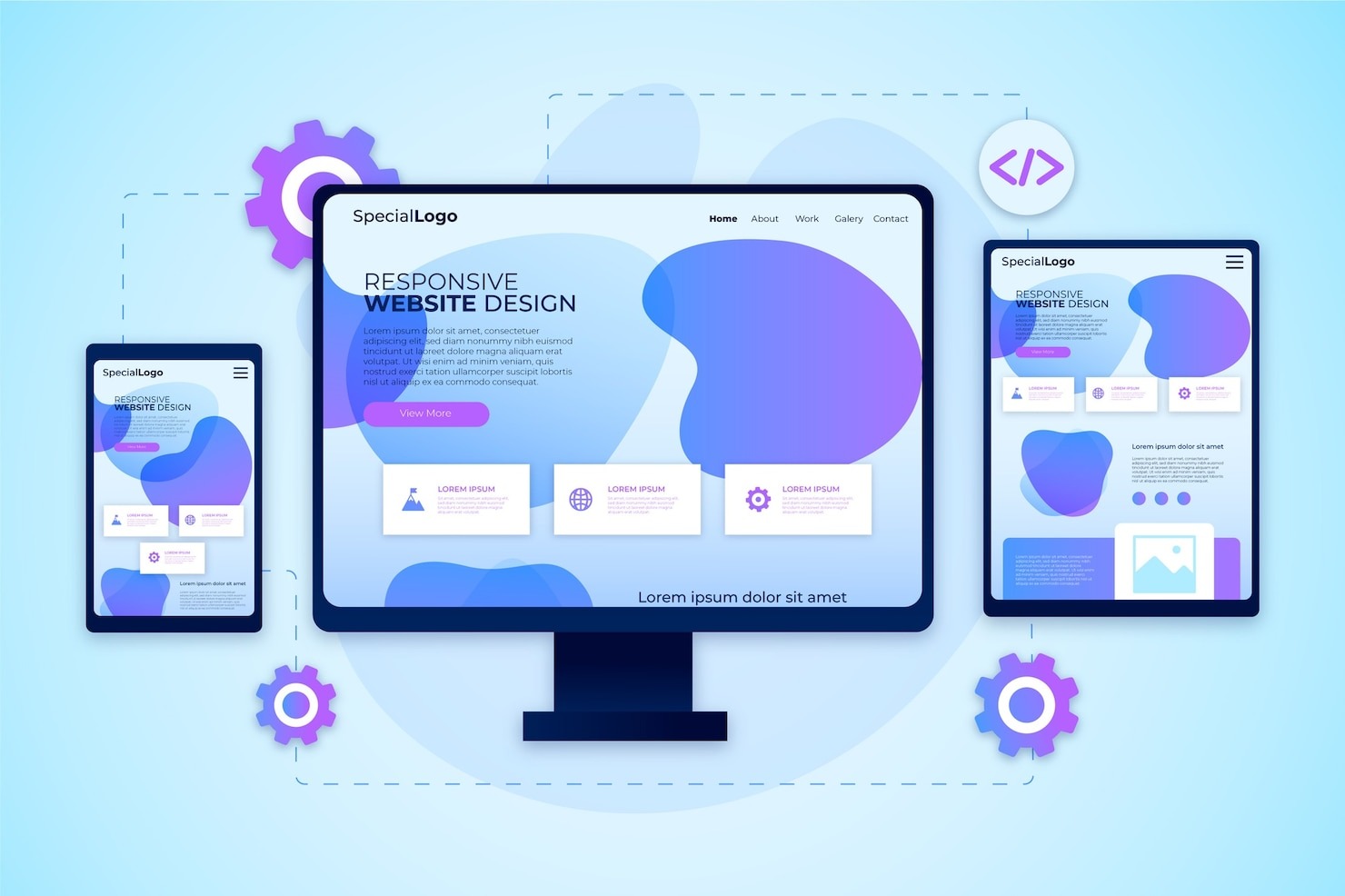
Responsive design is a web development approach where a website automatically adjusts its layout, content, and functionality based on the user’s screen size. Whether on desktop, tablet, or smartphone, the user experience remains consistent and seamless.
Key features of responsive design:
-
- Flexible grid layouts
- Scalable images and media
- Adaptive navigation menus
- CSS media queries for different devices
What is Mobile-First Design?
Mobile-first design means designing a website primarily for mobile devices before scaling it up for desktops. With Google’s mobile-first indexing, search engines now rank websites based on their mobile performance first.
Benefits of mobile-first:
-
- Improved SEO rankings
- Faster loading times on mobile
- Better user experience
- Higher engagement and conversions
Why Responsive & Mobile-First Design Matters in 2025
-
- SEO Benefits – Google prioritizes mobile-friendly websites in search rankings.
- User Experience – A smooth mobile experience reduces bounce rates.
- Increased Conversions – Users are more likely to engage and purchase when browsing is effortless.
- Future-Proofing – With new devices emerging, responsive design ensures your site remains adaptable.
1. Start with Mobile Wireframes
Design your site for small screens first, then expand to tablets and desktops. This ensures core features are prioritized.
2. Use Fluid Grid Layouts
Replace fixed pixel layouts with percentage-based grids that adapt to screen size.
3. Optimize Images & Media
-
- Use modern formats like WebP or AVIF
- Enable lazy loading
- Compress images without losing quality
4. Implement Flexible Typography
Use em, rem, or vw units for font sizes so text scales well across devices.
5. Simplify Navigation
Use hamburger menus or collapsible navigation bars for mobile screens.
6. Leverage Media Queries
CSS media queries allow you to apply styles based on device width, ensuring your layout looks good everywhere.
7. Prioritize Speed & Performance
Mobile users often rely on slower networks. Use caching, minification, and CDNs to improve load times.
8. Test Across Devices
Check performance on multiple devices and browsers with tools like:
-
- Google Mobile-Friendly Test
- BrowserStack
- Lighthouse
Quick Checklist for Mobile-First & Responsive Websites
-
- Mobile-first wireframing approach
- Responsive grid and flexible layouts
- Optimized images and media
- Fast-loading, lightweight design
- Accessible and readable typography
- Simplified, mobile-friendly navigation
- Tested across multiple devices
In 2025, responsive design and mobile-first development are essential for SEO, user experience, and business success. A well-optimized mobile site not only improves your Google rankings but also ensures customers stay engaged, explore your content, and convert into loyal buyers.
Remember: Start small, think mobile, and then scale up. That’s the key to building websites that work for everyone.
Benefits With Our Service
- Technology Consultancy
- Maintenance And Support
- We Provide best services
- Requirements Gathering
- Business Growth

Our services offer tailored solutions to meet your unique needs, driven by an experienced team and innovative technologies. We enhance efficiency and prioritize user experience, ensuring customer satisfaction while delivering cost-effective, proven results that empower your business to thrive.