


Responsive Design
Responsive Design: Seamless Across Every Screen
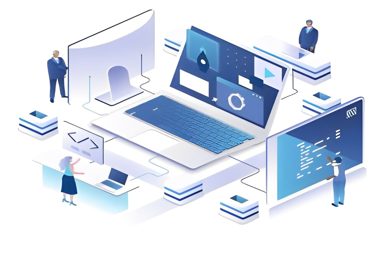
Responsive design ensures that your website is accessible and functional on all devices, enhancing user experience and improving SEO. By using fluid layouts, media queries, flexible images, and modern layout tools like Flexbox and CSS Grid, you can create websites that adapt seamlessly to different screen sizes and resolutions.
In the modern digital landscape, a responsive website is no longer a luxury—it’s a necessity. At Flax Infotech, our responsive design service ensures your website adapts flawlessly to any device, providing a consistent and seamless experience for users across desktops, tablets, and smartphones.
By leveraging cutting-edge technologies, flexible layouts, and advanced media queries, we create websites that are both visually stunning and highly functional. No matter the screen size or platform, your users will enjoy intuitive navigation, fast load times, and an immersive browsing experience that reflects your brand's identity.
The importance of responsive design cannot be overstated, as it directly impacts user engagement and conversion rates. In today’s mobile-first world, more than half of all web traffic comes from mobile devices. Having a responsive website means you’re catering to your users' needs, no matter where they access your site from. Whether they’re on a large desktop monitor or a small mobile screen, your website will provide the best possible experience.
A key benefit of responsive design is its role in improving SEO. Search engines like Google prioritize mobile-friendly websites, making responsive design crucial for ranking higher in search results. When you use responsive design, you ensure that your website has a single URL for all devices, which simplifies indexing and boosts SEO. Additionally, your site will load faster on mobile devices, improving your bounce rate and user retention.
At Flax Infotech, we follow industry best practices to ensure your website is fully optimized for all screen sizes and devices. We implement fluid grids that allow your site to resize based on the width of the user’s screen, ensuring that images, text, and navigation elements remain proportionate and easy to read. By utilizing advanced media queries, we adjust the layout of your website based on the specific characteristics of each device, delivering a tailored experience that is consistent with your brand's aesthetics and functionality.
Our responsive design approach goes beyond just aesthetics; it's about improving the usability and accessibility of your website. We make sure that navigation is intuitive, buttons and links are easily clickable, and your content is easily digestible, regardless of the device your users are using. This focus on usability ensures a positive experience, encouraging users to spend more time on your site and engage with your content.
With our expertise in modern CSS techniques such as Flexbox and CSS Grid, we create flexible layouts that automatically adjust to the user’s screen size. Whether it's reflowing content, resizing images, or adjusting the position of elements, we ensure that your site functions seamlessly across all screen sizes—from mobile devices and tablets to desktops and large monitors.
We understand that every business has unique needs, which is why our responsive design services are tailored to your brand and target audience. Whether you're in e-commerce, healthcare, education, or any other industry, we create websites that not only look great on all devices but also drive conversions, engage users, and help your business succeed.
A responsive website isn't just about staying current; it's about future-proofing your business. As new devices and screen sizes emerge, a responsive website ensures your site remains compatible and accessible. Our responsive designs are built with scalability in mind, so as the digital landscape evolves, your site continues to deliver a consistent experience to your users.
Ready to create a seamless user experience that spans all devices? At Flax Infotech, we specialize in responsive design that elevates your online presence and maximizes user engagement. Contact us today, and let’s collaborate on creating a website that is as dynamic and adaptable as your business.
Benefits With Our Service
- Device-Independent Flexibility
- Enhanced User Engagement
- SEO-Friendly Architecture
- Customized Excellence for Your Business Goals
- Empowering Your Future with Cutting-Edge Technology
- A 360° Approach to Exceptional web design services
- Scalable Solutions for Sustainable Growth

Empower your brand with a responsive website that stands out from the competition. Let us create a digital experience that not only adapts to every device but also elevates your business to new heights.
All Services
Opening Hours
- Mon - Sat: 10.00 AM - 7.00 PM
- Sun: 09.00 AM - 4.00 PM
- Emergency: 24 hours